| Multiplying People | Statistics In Your World |
| Student Notes | ||||||||||||||||||||||||||||||
| Teachers Notes | ||||||||||||||||||||||||||||||
| How Many Of Each Age? Comparing Towns Comparing Countries What About the Workers? |
Population Pyramids How Many of
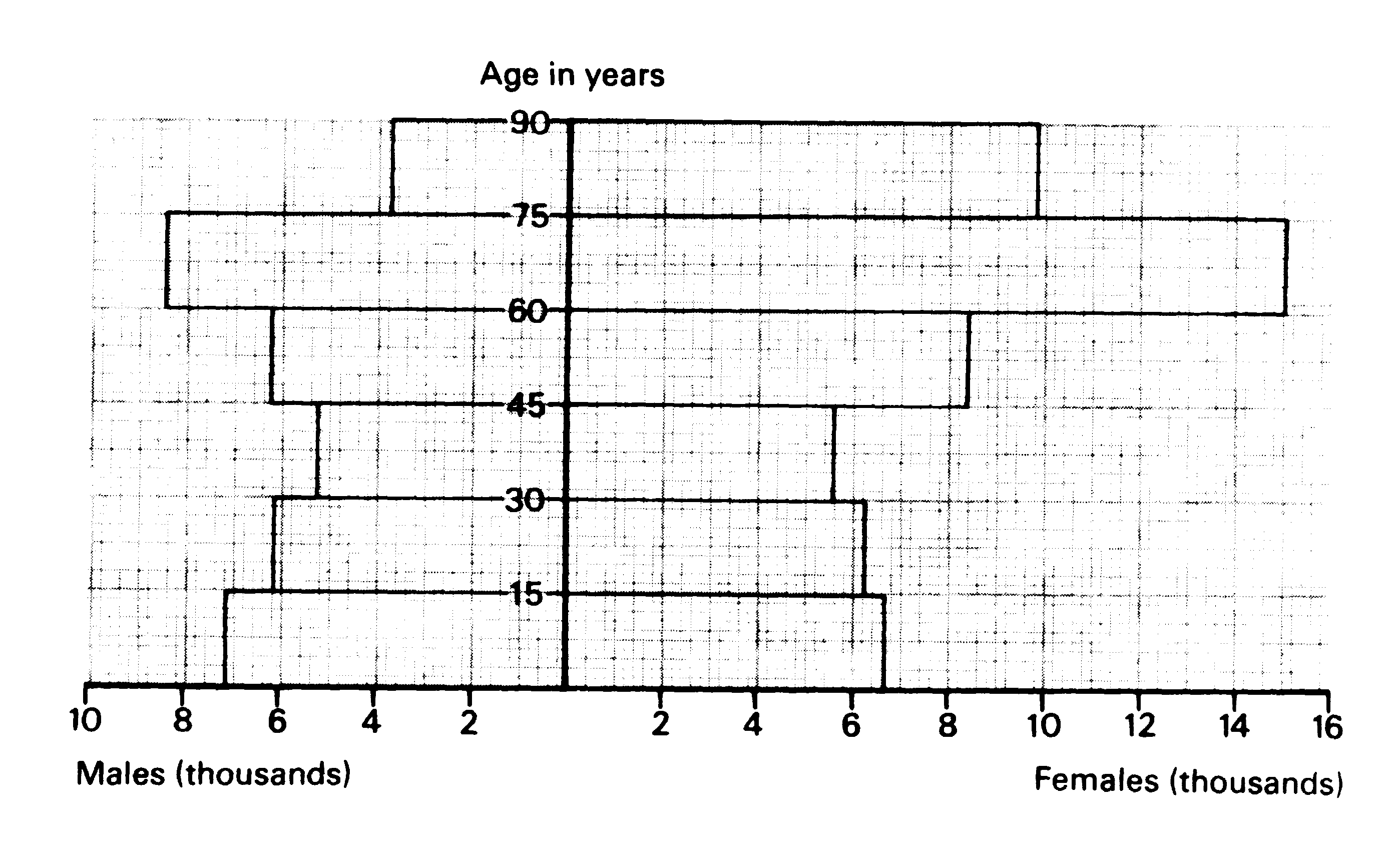
Each Age? This information is often drawn as a POPULATION PYRAMID which shows the number of men and the number of women in each age group. Figure 2 shows the population pyramid for the seaside town of Worthing on 25 April, 1971. The figures for the men are on the left. The figures for the women are on the right. The total population was 88500.
Population pyramids can he drawn for large populations (e.g. for a country,') and for small populations (e.g. a particular town). If your job is to build a school, a sports centre or an old people's home in a town, it is not enough to know how many, people live there. You also need to know how many, young people and how many old people there are. A population pyramid gives this information. Study the population pyramid in Figure 2 carefully, then answer
the following questions. Let us see if the age distribution of Worthing is typical of the rest of the country. Look carefully at the population pyramids for England and Wales and for Worthing, and
then answer the following questions. The modal age group is the one with the highest
population.
Comparing
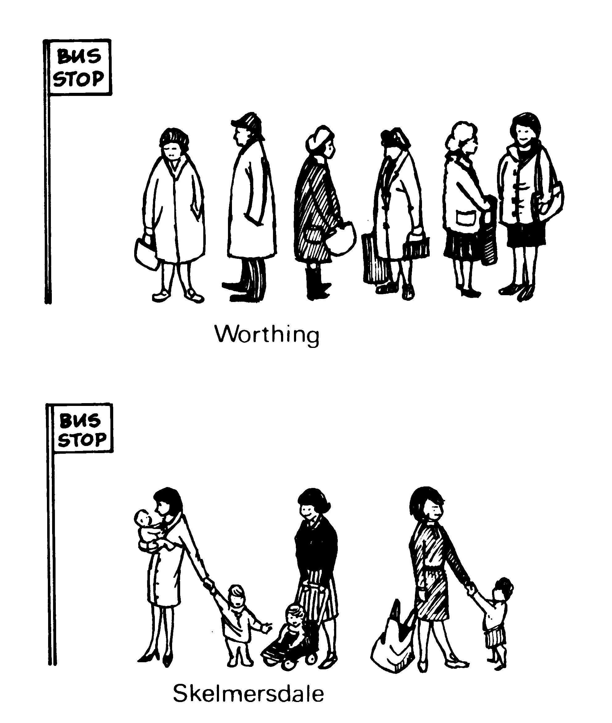
Towns As you have seen, population pyramids are important for planning towns. Figure 3 shows people waiting at bus stops in Worthing and Skelmersdale.
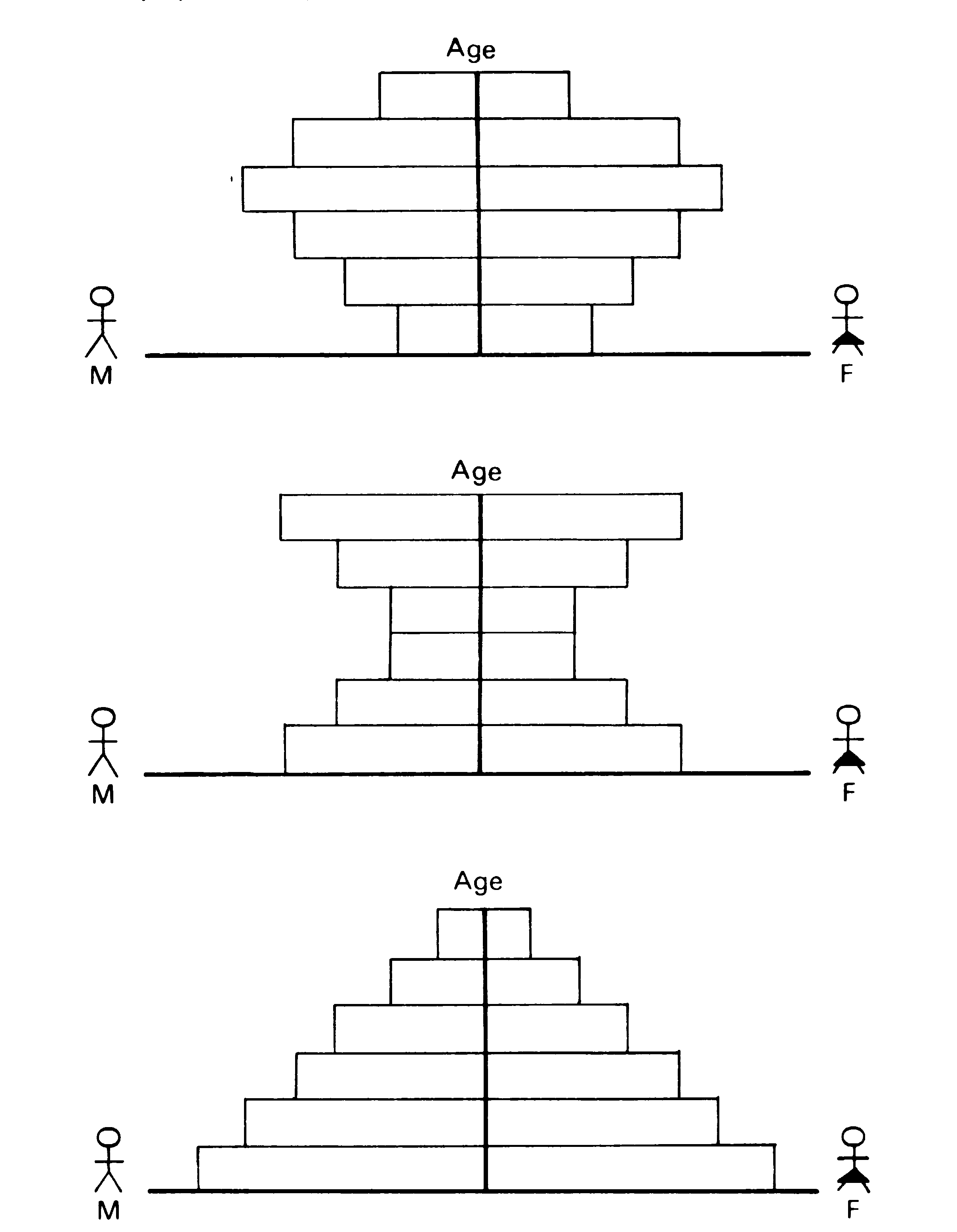
To compare age distributions between two towns, we sometimes draw population pyramids
showing the percentage of the population in each Year group. This makes it easier to
compare the shape of the pyramids. Table 4 - Percentage of population in different age
groups,
Comparing
Countries For instance, in a developing countrv a lot of children are born (though manv die
before thes, are five), and few people live bevond 50 vears of age. In a more developed
countrv fewer babies are born, and people live longer.
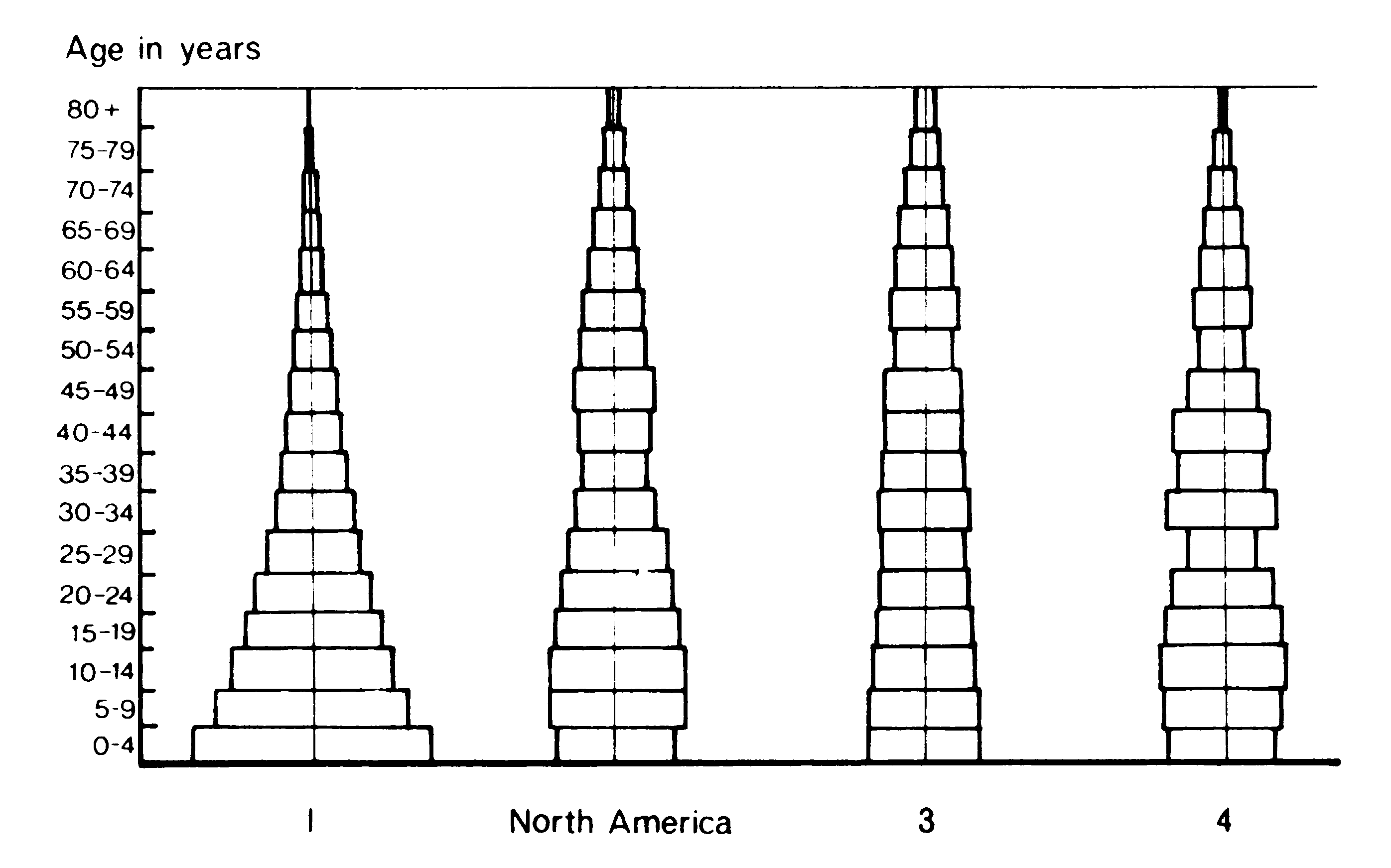
The four pyramids in Figure 5 represent the populations in 1970 of North America, USSR, Africa and Western Europe. but not in that order. Note: They show population proportions, not population size.
Here are some clues to help you. Africa should have a high birth rate and low life expectancy. Both Western Europe and USSR suffered in World War 2 (1939-1945), USSR more than Western Europe.
What About
the Workers? Soldiers, nurses, old age pensioners, factory workers, school children You can of course only tell the age of people from the population pyramids. A dependant is someone who is too young or too old to work. Normally those under 15 or over 65 are classed as dependants. Using the pyramids, we can find the number of dependants in a population. The best guide to future population growth is the proportion of females of
child-bearing age (15-44 years).
|
|||||||||||||||||||||||||||||